Data Visualization
Data visualization is the graphical representation of information and data. It uses visual elements like charts, graphs, and maps to present complex information in a way that is easily understandable and digestible. The goal is to communicate insights from data quickly and efficiently.
Effective data visualization helps uncover patterns, trends, correlations, and outliers that might not be apparent in raw data. It allows for better decision-making by making data more accessible and facilitating a deeper understanding of the information. Visualization tools and techniques vary widely, allowing for creative and impactful ways to present data, catering to different audiences and purposes.
Visualizing Data using Tableau Public
Tableau Public is a powerful and user-friendly data visualization tool that brings data to life through interactive and compelling graphics. Aimed at individuals and organizations looking to share insights with a wider audience, Tableau Public allows users to create and publish interactive visualizations on the web for free. With an intuitive drag-and-drop interface, users can seamlessly connect to various data sources, transform raw data into meaningful visual stories, and share their findings with the world.
Whether it's creating dynamic dashboards, interactive maps, or visually stunning charts, Tableau Public enables users to explore and communicate complex datasets in a way that is accessible to a broad audience. The platform's emphasis on collaboration and openness fosters a vibrant community where users can inspire and learn from each other's innovative visualizations, making data-driven storytelling more engaging and impactful.
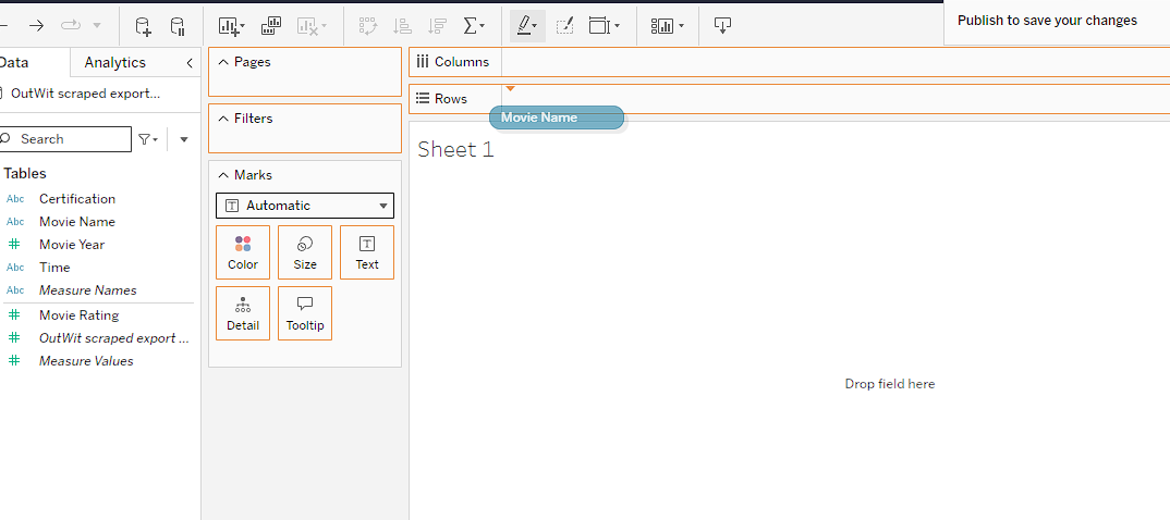
Create a worksheet: Open Tableau Public in a browser and click ‘create’ to upload and visualize your project. Select ‘Web authoring’ for continuing on the browser.

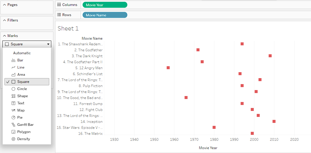
Creating coordinates: Drag and drop the table to either ‘columns’ or ‘rows’ as you want.
Select the marks: From the option ‘Marks,’ select the suitable visual method to represent the data accurately.